Amazon KDP Journal Template: Design Tips for Eye-Catching Covers
Share
Creating a journal to sell on Amazon KDP can be a rewarding venture but it requires careful planning and design. To effectively create journals, you need to select the right tools for design and layout, and consider creating niche-specific journal series to attract a broader audience. From choosing the right type of journal to crafting an appealing cover, every step is crucial for attracting potential buyers. KDP journals fit inside the Amazon low content category of books and having created hundreds of amazon KDP journals and coloring books, I thought I would share some insights - this article will guide you through essential design tips that can help your journal stand out in a crowded marketplace.

Amazon KDP Journal Template - Key Takeaways
- Select a journal type that aligns with your audience's needs.
- Your cover should grab attention; consider using tools like Canva or Adobe Photoshop.
- Understand color psychology to evoke the right feelings with your design.
- Choose fonts wisely; a good pairing can enhance readability and appeal.
- Test your design by gathering feedback and making necessary adjustments.
Understanding Amazon KDP and Journal Sales
What is Kindle Direct Publishing (KDP)?
Kindle Direct Publishing (KDP) is Amazon’s self-publishing platform that makes it incredibly easy for anyone to publish their books, including journals, in both digital and print formats. The best part? There are no upfront costs or inventory risks. With KDP, you can create and sell journals, planners, and other types of books, and earn up to 70% royalty on each sale. This self-publishing platform is a game-changer for aspiring authors and creators, offering a straightforward way to get your work out there and start earning.
The Role of Amazon KDP in Journal Sales
Amazon KDP plays a pivotal role in journal sales by providing a robust platform for creators to publish and sell their journals to a global audience. With KDP, you can design a professional-looking journal complete with custom covers and interior pages, and list it for sale on Amazon.com. The print-on-demand service means you don’t have to worry about inventory or upfront costs, making it a low-risk venture. Plus, KDP offers various promotional tools and marketing strategies to help boost the visibility and sales of your journal. This means you can focus on creating while KDP handles the logistics, allowing you to earn passive income from each sale.
Choosing the Right Journal Type
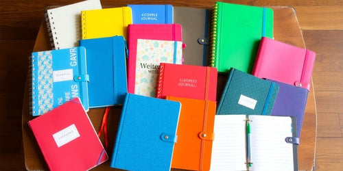
When we start creating a journal, the first thing we need to think about is what type of journal we want to make. There are several options out there and each one has its own vibe - let's have s a quick look at some popular types:
Understanding Your Audience
- Who are we making this for? Knowing our audience helps us decide on the journal type. Are they students, professionals, or hobbyists?
- What do they need? Think about what our audience might want to write about or track.
- How will they use it? Some might want a journal for daily thoughts, while others might need it for planning or tracking goals.
Different Types of Journals
Here’s a simple table to help us understand the different types:
| Journal Type | Description | Best For |
|---|---|---|
| Lined Journal | Classic lined pages for writing | General writing |
| Blank Journal | Empty pages for free expression | Artists and doodlers |
| Bullet Journal | A mix of lists and notes | Organizers and planners |
| Guided Journal | Prompts to help with writing | Self-reflection seekers |
Pros and Cons of Each Type
- Lined Journals: Great for writing but can feel limiting.
- Blank Journals: Super flexible but might be intimidating for some.
- Bullet Journals: Fun and organized but require more effort to set up.
- Guided Journals: Helpful for beginners but may not suit everyone’s style.
Choosing the right journal type is crucial, it sets the tone for everything else we do in our design process - let’s make sure we pick one that resonates with our audience!
Designing an Eye-Catching Cover

When it comes to creating a book cover that grabs attention, we need to keep a few key things in mind. First impressions matter! A well-designed cover can make all the difference in attracting readers. Here’s how we can make our covers pop:
Importance of First Impressions
- The cover is the first thing potential buyers see. It should reflect the journal's purpose and vibe.
- A striking cover can lead to more sales, so let’s make it count!
- Think about what message we want to send with our design.
Using Design Software
- We can use tools like Canva or Adobe Photoshop to create our covers. They offer tons of templates and features.
- Here’s a quick comparison of popular design tools:
| Tool | Ease of Use | Features | Cost |
|---|---|---|---|
| Canva | Very Easy | Templates, Icons | Free/Paid |
| Adobe Photoshop | Moderate | Advanced Editing | Subscription |
| BookBrush | Easy | Mockups | Free/Paid |
- Choose the one that fits our skill level and needs.
Experimenting with Fonts and Colors
- Fonts can set the tone - pick a font that matches our journal’s theme. For example, a playful font for a kids’ journal or a sleek font for a professional one.
- Here are some tips for font selection:
- Use bold fonts for titles to grab attention.
- Pair a fancy font with a simpler one for balance.
- Avoid overly complicated fonts that are hard to read.
- Colors also play a huge role. We should think about the feelings different colors evoke - for instance, blue can feel calm, while red can be exciting.
Mastering Color Theory for Your Journal Cover

Psychology of Colors
When we think about colors, it’s not just about what looks pretty; colors can actually change how people feel! For our journal covers we want to pick colors that match the vibe we’re going for. Here’s a quick rundown:
- Red: Excitement and passion. Great for romance or thrillers.
- Blue: Calm and trustworthy. Perfect for self-help or business journals.
- Green: Nature and health. Ideal for gardening or wellness topics.
- Yellow: Happy and energetic. Works well for children’s journals.
- Purple: Mysterious and luxurious. Good for fantasy or spiritual themes.
Popular Color Choices
Here’s a simple table to help us visualize some popular color choices and their meanings:
| Color | Meaning | Best For |
|---|---|---|
| Red | Passion, excitement | Romance, thrillers |
| Blue | Calmness, trust | Non-fiction, self-help |
| Green | Nature, growth | Gardening, health |
| Yellow | Happiness, energy | Children’s books |
| Purple | Mystery, spirituality | Fantasy, romance |
Combining Colors Effectively
Now that we know what colors mean, let’s talk about how to mix them. Here are some tips:
- Use complementary colors: These are colors that are opposite each other on the color wheel. They look great together!
- Try analogous colors: These are next to each other on the wheel. They create a nice, harmonious look.
- Limit your palette: Stick to 2-3 main colors to keep things simple and clean.
Remember, the goal is to create a cover that not only looks good but also speaks to your audience - you should have fun experimenting with colors - it also good to have a number of color variations of your designs - this gives the potential buyer choices and hopefully increased sales.
Typography Tips for Journal Covers

Choosing the Right Font
When we pick fonts for our journal covers, we need to think about how they make people feel. Different fonts can create different vibes! Here are some common types:
- Serif Fonts: These are classic and trustworthy. Great for serious topics like history or non-fiction.
- Sans-Serif Fonts: Clean and modern, perfect for self-help or young adult genres.
- Script Fonts: These look elegant and personal, often used in romance or poetry.
- Display Fonts: Unique and eye-catching, ideal for fantasy or children’s books.
- Bold Fonts: Strong and impactful, they grab attention, especially in thrillers or action stories.
Pairing Fonts for Impact
To keep our designs looking sharp, we should stick to one or two fonts that go well together. Mixing too many can confuse our readers - If we use a fancy font for the title, a simpler font for the author’s name works best.
Avoiding Common Typography Mistakes
Here are some common pitfalls to dodge:
- Using too many fonts: Stick to one or two.
- Ignoring font size: Make sure the title is big enough to read.
- Clashing styles: Avoid mixing fonts that don’t match.
Remember, the goal is to create a cover that’s easy on the eyes and makes people want to pick up your journal!
Utilizing White Space in Your Design
What is White Space?
White space, often called negative space, is the area around your design elements - it’s not just empty space; it’s a key part of your design! Using white space wisely can make your journal cover look clean and professional.
Benefits of White Space
- Enhances Readability: It helps your text stand out, making it easier for readers to absorb the information.
- Creates Balance: A well-balanced design feels more appealing and organized.
- Focuses Attention: It draws the eye to important elements like your title or images.
How to Use White Space Effectively
- Keep it Simple: Don’t overcrowd your cover. Leave enough space around your title and images.
- Highlight Key Elements: Use white space to emphasize your main message or visuals.
- Experiment with Layouts: Try different arrangements to see how white space can change the feel of your design.
Remember, white space is crucial for enhancing readability and creating a clean, sophisticated look. It helps balance your layout, makes content easier to digest and allows your design to breathe!
Designing the Interior Pages of Your Journal
Genre-Specific Design Considerations
When we’re designing a journal cover, it’s super important to think about the genre. Getting the vibe right can make all the difference! Here’s how we can nail it:
Researching Your Genre
- Dive into what’s popular in your genre. Check out bestsellers and see what colors, fonts, and images they use.
- Notice what’s trending and what’s not. This helps us understand what readers are looking for.
- Look for patterns in design elements that stand out.
Matching the Mood
- Think about how we want people to feel when they see our cover. For example, a finance journal might not use bright colors.
- The mood should reflect the content. A calming design works for wellness journals, while something bold might suit a travel journal.
Setting the Scene
- Our cover should give a sneak peek of what’s inside, like a movie trailer!
- Use visuals that hint at the journal’s purpose for example, a nature journal might feature leaves or landscapes.
- Make sure the design invites readers to open the journal and start writing.
Remember, the cover is our first chance to grab attention and for a simple journal, it can be the main reason that someone would buy your book.
Technical Aspects of Cover Design
When it comes to designing a journal cover, we need to pay attention to some technical details that can make or break our design.
Amazon's Specifications
First off, we should know that Amazon has specific guidelines for cover images. Additionally, accurately filling out the book details, such as language, title, author, and description, is crucial as these details can significantly affect the visibility and categorization of the book. The ideal size of your ebook cover art is a height/width ratio of 1.6:1. This means that for every 1,000 pixels in width, the image should be 1,600 pixels tall. Here’s a quick reference table:
| Aspect | Specification |
|---|---|
| Width | 1,000 pixels |
| Height | 1,600 pixels |
| Ratio | 1.6:1 |
File Formats and Sizes
Amazon will only accept certain file formats, if you stick to below then you will be fine.
- JPEG: Great for most covers, easy to upload.
- PNG: Good for images with transparency.
- PDF: Sometimes required for print versions.
Make sure our files are not too large; we want them to load quickly!
Previewing Your Design
Finally, we can’t forget about previewing our design - before we hit that publish button, let’s:
- Check how it looks in different sizes, especially as a thumbnail.
- Get feedback from friends or fellow authors.
- Make adjustments based on what we see and hear.
Remember, a well-designed cover can attract more readers and boost our sales!
Pre-Publishing Activities
Before you hit the “publish” button on Amazon KDP, there are several crucial steps to ensure your journal’s success. Here’s a quick rundown of what you need to do:
- Keyword Research: Identify the keywords that potential buyers are searching for. Use these keywords in your title, subtitle, and description to improve your journal’s visibility on Amazon.
- Design Your Interior Pages: Make sure your journal’s interior pages are well-designed and functional. Whether it’s lined pages, prompts, or grids, the layout should be user-friendly and appealing.
- Create a Compelling Cover: Your journal cover is the first thing buyers will see, so make it eye-catching and relevant to your audience. Use design tools like Canva or Adobe Photoshop to create a professional-looking cover.
- Write a Captivating Description: Your book description should highlight the unique features and benefits of your journal. Make it engaging and informative to entice potential buyers.
- Set Up Your KDP Account: If you haven’t already, create a KDP account. This is where you’ll upload your journal, set your pricing, and manage your sales.
- Choose Your Print Options: Decide on the size, paper type, and paperback cover finish for your journal. KDP offers various options to suit different preferences and budgets.
- Preview Your Journal: Use KDP’s preview tool to check how your journal will look in print and digital formats. Make any necessary adjustments to ensure everything is perfect.
By completing these pre-publishing activities, you’ll be well-prepared to launch your journal on Amazon KDP and maximize its chances of success.
Common Mistakes to Avoid

When we’re designing our journal covers, it’s super easy to slip up - here are some common mistakes we should keep an eye out for:
Incorrect Dimensions and Resolution
- Does your cover meet Amazon KDP’s dimension requirements? If it’s too small or too large, we might end up with poor print quality or even rejection.
- The resolution should be at least 300 DPI for clear, sharp printing.
Ignoring Bleed and Margin Guidelines
- Neglecting the bleed settings can lead to important elements being cut off or white edges showing in the final print.
- Keep critical text and design elements within the safe margin to avoid them being trimmed.
Overlooking Spine and Back Cover
- For print books, the spine and back cover design are just as important as the front cover. Incorrect spine width or misaligned text can affect the overall look.
- The back cover should be well-designed and include essential elements like a barcode area, which KDP can provide.
Not Previewing Before Submission
-
Always use Amazon’s preview tool to check how your cover will look in print and digital formats. This can catch unexpected issues like misalignment or color variation.
Remember, we can always learn from our mistakes! If we need to make changes, it doesn’t mean we failed. Let’s keep growing and improving our designs! Previewing and refining your design can be so much fun, making the process enjoyable and engaging.
Using Design Tools and Software

When it comes to creating our journal covers, the right tools can make all the difference.
Canva for DIY Design
Canva is a fantastic choice for those of us who want to create stunning covers without needing a design degree. Here’s why:
- Wide Range of Templates: We can choose from tons of templates, graphics, and fonts.
- User-Friendly: The drag-and-drop feature makes it super easy to customize our designs.
- Affordable Pro Options: If we want more features, the pro account is budget-friendly and offers even more templates.
Adobe Photoshop and Illustrator
For those of us who are a bit more experienced, professional software like Adobe Photoshop and Illustrator can take our designs to the next level:
- Advanced Customization: We can control every detail, from layout to typography.
- Flexibility: These tools allow for intricate designs that can really stand out.
- Learning Curve: It might take some time to master, but there are plenty of tutorials available.
AI Tools for Inspiration
Using AI tools like DALL-E can also be a game-changer:
- Generate Ideas: We can create unique design concepts quickly.
- Color Palettes: AI can help us find the perfect color combinations.
- Collaboration: We can take AI-generated designs and tweak them in Canva or send them to a designer.
The tools we choose depend on our experience and budget; whether we go for a DIY approach with Canva or opt for professional software, let’s make sure our cover truly reflects our journal’s content and grabs attention!
Testing and Refining Your Cover Design

Gathering Feedback
When we finish our cover design, it’s time to get some opinions. Feedback is super important! Here’s how we can do it:
- Ask friends and family what they think.
- Share it on social media and see what people say.
- Don’t forget to ask local librarians or bookstore staff; they know what sells!
Making Adjustments
Once we gather feedback, we need to look for patterns - if several people mention the same issue, it’s worth considering a change. Here are some steps to follow:
- Identify common feedback points.
- Decide which changes will improve the design.
- Make those adjustments and get ready for another round of feedback!
Finalizing Your Design
After tweaking our cover, it’s time to finalize it. We should ask ourselves:
- Is the title easy to read?
- Does the cover image fit the book’s theme?
- Will it stand out among other books in the same genre?
Remember, a great cover can make a huge difference in attracting readers. Let’s make sure ours is the best it can be!
Marketing Your Journal on Amazon

When it comes to selling our journals on Amazon, we need to get the word out! Marketing is key to making our journals stand out and attracting buyers. Here are some tips to help us shine:
Optimizing Your Listing
- Use clear, high-quality images of our journal covers.
- Write engaging descriptions that highlight what makes our journals special.
- Include relevant keywords like "amazon kdp account" and "amazon kdp publishing" to help our journals show up in searches.
Using Keyword Research Effectively
- Research popular keywords related to our journal's theme.
- Use these keywords in our title and description to improve visibility.
- Consider using tools to find trending keywords in the journal niche.
Promotional Strategies
- Leverage Amazon Advertising: Create targeted ads to reach more potential buyers.
- Gather Customer Feedback: Use reviews to improve our listings and show off positive feedback.
- Engage on Social Media: Share our journals on platforms like Instagram and Facebook to reach a wider audience.
By focusing on marketing, we can increase our journal's visibility and boost sales on Amazon. Let's make our journals the go-to choice for buyers!
If you want to get your journal noticed on Amazon, start by creating an eye-catching cover and writing a great description, use keywords that people might search for and don't forget to ask your friends and family to leave reviews! For more tips and resources, visit our website today!
Wrapping It Up: Your Journey to Stunning Journal Covers
Designing a journal cover for Amazon KDP doesn’t have to be a headache, just remember to pick the right type of journal, create a cover that pops and format everything just right. Don’t forget to have fun while you’re at it! Experiment with colors, fonts, and images until you find what feels right and if you ever feel stuck, there are tons of resources out there to help you out. Now go ahead and unleash your creativity—your perfect journal cover is waiting!

Further Reading on the Amazon KDP Business Model
Frequently Asked Questions
What types of journals can I create for Amazon KDP?
You can start by creating journals like lined, blank, bullet, and guided journals. Choose one that fits your audience’s needs.
Why is the cover design important for my journal?
The cover is the first thing people see. A good design can attract more buyers and make your journal stand out.
What design tools can I use to create my journal cover?
You can use tools like Canva, Adobe Photoshop, or even AI tools to design your cover.
How do I choose the right colors for my journal cover?
Think about the feelings you want to evoke. For example, blue is calming, while yellow is cheerful.
What should I consider when picking fonts for my cover?
Choose fonts that are easy to read and match the mood of your journal. Pair bold fonts with simpler ones for balance.
How can I effectively use white space in my design?
White space helps your design look clean and highlights important elements like the title.
What are some common mistakes to avoid when designing my cover?
Avoid incorrect dimensions, ignoring bleed guidelines, and overlooking the spine and back cover designs.
How can I market my journal on Amazon?
Optimize your listing with the right keywords and consider promotional strategies to increase visibility.


